U-Like, a renowned name in Taiwanese household products and cookware, has long been synonymous with quality, innovation, and reliability. Over the years, our brand has evolved, catering to diverse kitchen and home needs with a wide range of products. However, as markets shift and consumer preferences evolve, it’s essential for brands to adapt and refresh their image. Thus, U-Like embarks on a journey of re-branding to better align with modern sensibilities and continue serving our valued customers with excellence.
The Inspiration Behind the New Look
In the quest for a fresh identity, U-Like drew inspiration from its roots in Taiwanese craftsmanship and innovation. The creative process delved deep into the essence of our brand, seeking to encapsulate the spirit of tradition and progress. Key elements of the new branding reflect a fusion of timeless elegance and contemporary flair, aiming to resonate with both longstanding patrons and new audiences alike. From sleek design elements to colour palettes that reflects our brand’s identity and personality, every choice embodies our commitment to quality and customer satisfaction. This re-branding isn’t just a cosmetic change; it's a reaffirmation of U-Like's dedication to excellence and a revitalization of our brand for the future.
The Logo
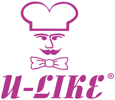
U-Like's new logo embodies a harmonious blend of tradition and modernity. At its core, the logo retains the iconic "U" shape, representing our unwavering commitment to excellence and customer satisfaction. However it undergoes a playful transformation, infusing a sense of joy and excitement into our brand identity. This dynamic reinterpretation of the "U" symbolizes U-Like's vibrant spirit and our dedication to making cooking a fun and enjoyable experience for all. Its whimsical curves and energetic lines reflect the creativity and innovation that drive us forward. As the cornerstone of our new branding, this spirited "U" serves as a beacon, inviting customers to embark on a culinary adventure with us, where every meal is a celebration of flavour and imagination.
The "U" is now encased within a round-faced chef icon as we pay homage to the culinary heritage we cherish. The circular frame, symbolizing unity, continuity, and the cyclical nature of innovation while the chef icon symbolizes our commitment to quality craftsmanship and culinary expertise. This iconic figure embodies the passion and dedication that drive us to deliver exceptional kitchenware, inspiring culinary creations in homes worldwide. As a focal point of our logo, the chef icon represents not just a brand, but a trusted partner in every kitchen journey, empowering chefs of all levels to cook with confidence and flair. Overall, the logo reflects U-Like's evolution while staying rooted in our core values of quality, reliability, and innovation.
Colour Palette
The new colour palette for U-Like is a carefully curated selection that evokes feelings of warmth, vitality, and sophistication. Based from the original colour palette that reflects our brand’s identity and personality, we selected one that is similar yet different. This time, U-Like embraces a rich and vibrant hue that speaks to our brand's passion and creativity. This bold shade of magenta adds a touch of sophistication and flair, infusing our visual identity with warmth and energy. Symbolizing innovation and individuality, the colour fandango serves as a focal point, captivating attention and igniting excitement. Whether seen in our packaging, marketing materials, or online presence, this dynamic colour reflects U-Like's commitment to standing out and making a statement in the world of kitchenware.
Typography
In our re-branding effort, U-Like introduces "Elephant Ears Demo" as part of our new typography. Infusing a sense of whimsy and charm into our brand communications. This playful yet elegant font embodies creativity and uniqueness, perfectly complementing our redefined identity. With its distinctive letterforms and captivating curves, "Elephant Ears Demo" adds a touch of personality to our messaging, evoking feelings of warmth and approachability. Its clean typeface with rounded edges exudes a sense of friendliness and approachability while maintaining readability across various mediums, adding a touch of elegance and sophistication to our communications. Whether seen in our marketing materials or on our website, this font reinforces U-Like's commitment to innovation and creativity, inviting customers to join us on a journey of culinary exploration and delight.
Rollout and Implementation
Starting July 1st, 2024, U-Like will unveil its new branding across all channels. Our website, marketing materials, and social media profiles will undergo a transformation to reflect the fresh look and feel. From updated product packaging to revamped online presence, we're committed to ensuring a seamless transition for our valued customers.
The re-branding marks an exciting chapter for U-Like, enhancing our identity while staying true to our core values. We invite you to explore our new look and share your feedback as we continue to strive for excellence in serving your kitchen and home needs.
About U-Like
U-Like is dedicated to providing quality Taiwanese household products and cookware. Our mission is to innovate and inspire, making every kitchen experience exceptional. Visit our website to discover our range of products and services.
Experience the new U-Like! Visit our website today to explore our fresh look and discover quality products for your kitchen and home. Your feedback matters to us!

